I chose the Lego company, because the logo looked like it needed to be spiced up a bit. The first thing I did was found previous logo's from 1945 to today. On the top image I put the previous logos on the side and the color pallet on the bottom. I kept the same writing of "Lego" and simply added it to the Lego mans chest. On the business card I made the Logo really big and put a Gaussian Blur on it. I put the contact information on the card as well.
Friday, February 7, 2014
Thursday, February 6, 2014
Two Fruits
Logo Re-Design
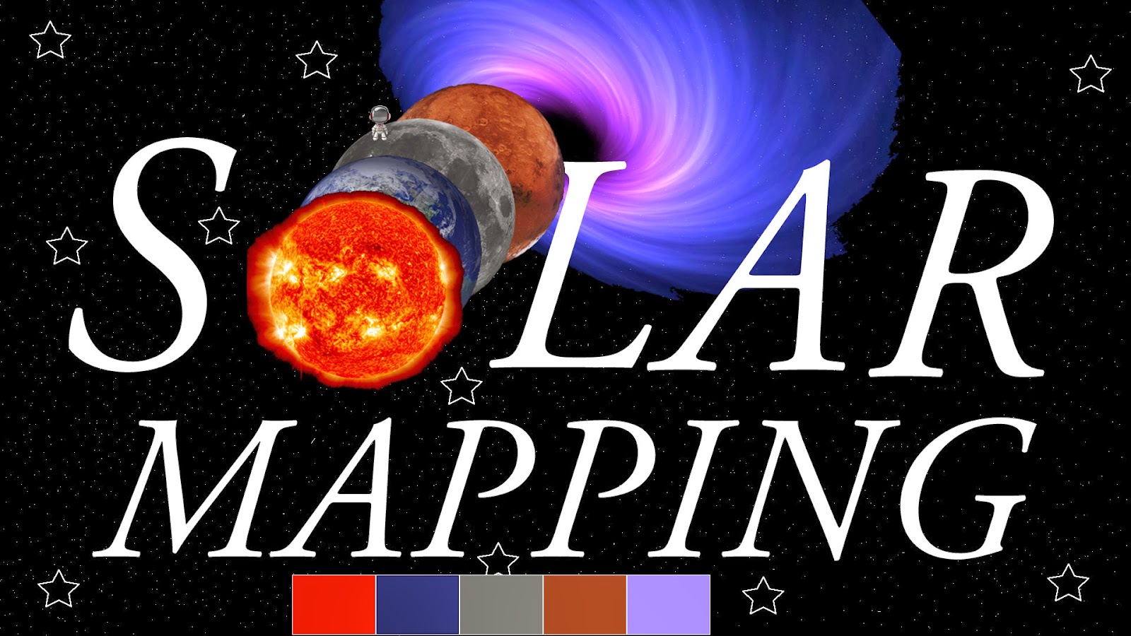
I re-designed the Solar Mapping business card. I used the spot color tool to get rid of all the extra black on the planets and black hole.Then I used the text tool to make the words S-LAR MAPPING. I also used the shape tool to create stars and put them in certain places. I used the Pen Tool to make white dots all over the background to make it seem like it is in the universe.
Subscribe to:
Comments (Atom)


