I chose the Lego company, because the logo looked like it needed to be spiced up a bit. The first thing I did was found previous logo's from 1945 to today. On the top image I put the previous logos on the side and the color pallet on the bottom. I kept the same writing of "Lego" and simply added it to the Lego mans chest. On the business card I made the Logo really big and put a Gaussian Blur on it. I put the contact information on the card as well.
Friday, February 7, 2014
Thursday, February 6, 2014
Two Fruits
Logo Re-Design
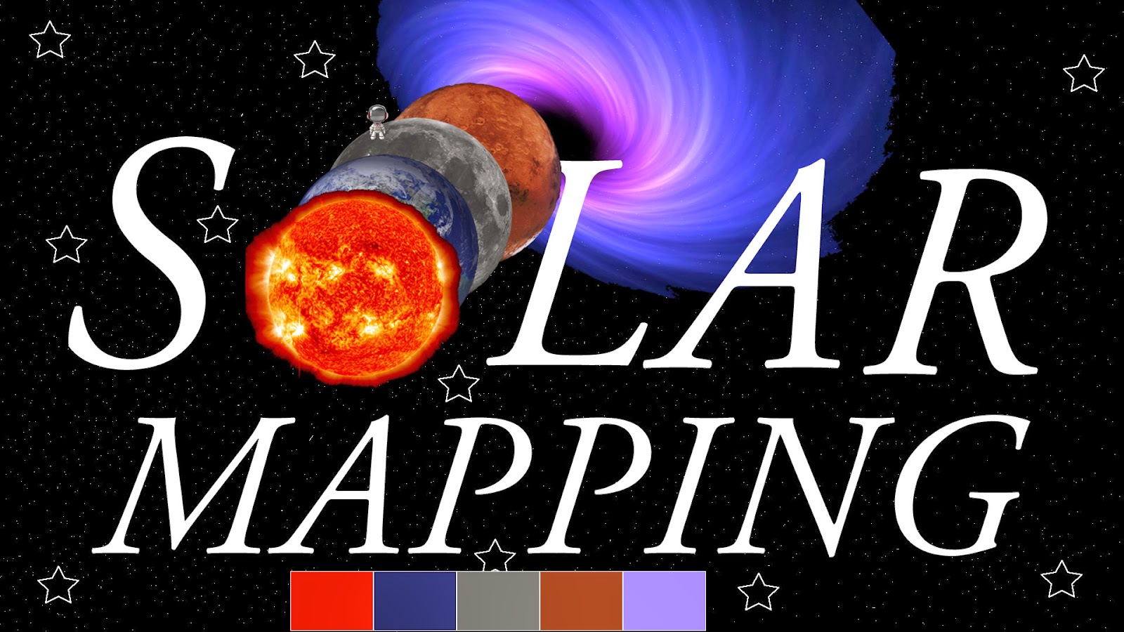
I re-designed the Solar Mapping business card. I used the spot color tool to get rid of all the extra black on the planets and black hole.Then I used the text tool to make the words S-LAR MAPPING. I also used the shape tool to create stars and put them in certain places. I used the Pen Tool to make white dots all over the background to make it seem like it is in the universe.
Thursday, January 30, 2014
Pictography
Image could not load
Check on server
I chose a strawberry for my pictograph. First I used the spot-color tools to get rid of all the white around the strawberry. Then I put the strawberry everywhere on the BIG strawberry to create a pictograph. I put the strawberry's a certain way on the stem so the red didn't show. Then I copied and pasted a lot of the strawberry's on the red parts of the berry.
Monday, January 27, 2014
Black Swan Business Cards
Image would not load
Unprofessional business card.
I opened the swan logo and flipped the swan upside down, and made it blue then made the background a lime green. I put an abstract picture inside the swan, by opening the photo then copying the photo, and pasting it inside the swan. I copied and pasted the address information from my teachers web page, and added the email. Then I with the text tool I wrote Black Swan Graphic Design.
I opened the swan logo, and moved it to the left.
I made the swan is black, and I put an abstract picture to mask the swan by copying the abstract picture then pasting it as a mask. I put the background as a maroon color. I put a glow, raised emboss, and an inset emboss on the swan. I copied the address information from my teachers wed page. Then added the email. After that I used the text tool to add Black Swan Graphic Design.
Professional business card.
I opened the swan logo, then copied and pasted another swan, I flipped one swan horizontally then put the swans together. I added a Ripple effect inside the swans then moved it around until it was perfectly in place. I copied and pasted the address information and added the email. With the text tool I wrote Black Swan Graphic Design.
Thursday, January 23, 2014
Typograph
The original picture of Ulysses S. Grant
The picture after I added words to it.
When I took the image off.
I chose the 18th president Ulysses S. Grant. He is on the $50.00 bill. I went on the internet and looked up words to describe him, battles he was in, how many children he had etc... I put the words into different layers then wrote them on the picture and put them into here places. when I was done with arranging them I changed there colors to match the photo.
Tuesday, December 17, 2013
Landscape- Spot Color
I used the Lasso tool to circle the color. The marquee tool to make
squares around the color. Also the magic wand tool to select certain
colors. I went to the Command tab and then made it gray scale.
Ladybug- Spot Color
I used the Lasso tool to circle the color. The marquee tool to make
squares around the color. Also the magic wand tool to select certain
colors. I went to the Command tab and then made it gray scale.
Guitar- Spot Color
I used the Lasso tool to circle the color. The marquee tool to make squares around the color. Also the magic wand tool to select certain colors. I went to the Command tab and then made it gray scale.
Wednesday, December 11, 2013
Raintree
I used the Lasso tool to circle the background colors and make them sepia. Also I used the marquee tool to make a square around the pixels. I used the magic wand tool and click in a color and it would get all of that color around it.
Monday, December 2, 2013
Cornucopia
Cannot load image.
The first thing I did to make my cornucopia was I selected the donut shape and made a large shape, then I got the circle shape and made big circles going into smaller circles. After that i still had the circle shape selected and I made the circle orange, then I selected the pencil tool and made slanted lines on the pumpkin. Afterwards I put a bevel emboss on the big pumpkin stem and created little pumpkins. Then I made A LOT of purple and green circles and arranged them to look like grapes. For the green and red apples I made a green/red circle and got the pencil tool and made a brown line. for the pairs I had a circle then used the sub select tool to stretch it to look like a pair, then copied and pasted several more. To make the corn I made a lot of little ovals and used the pencil tool to make the corn and arrange it how I wanted. I did almost the exact thing to the carrots that I did to the pairs, but I used the pencil tool to make green stems. For my tomatoes I used a red circle and pencil tools. For the eggplant I made a shape with the pencil tool and then colored it purple and made a green stem. For my background I made a strait line then selected the free-form tool and swooshed the line around until it made circular lines, then copied and pasted it several times. Also I used the the line tool to make orange dots in front of the black lines. For my name I selected the font tool and used Gabriola font then used the Raised Emboss, and Guassian Blur.
Monday, November 18, 2013
Emotion-Relaxed
The emotion I chose for this canvas is "Relaxed". I chose Relaxed because at night we go to sleep, the stars are out, the clouds are up. It makes you relaxed and ready for bed. First I made the background black. then added a lot of white circles and created clouds with them. After that I added little stars everywhere and made them dark blue and purple.
Emotion-Frustrated
This emotion is "Frustrated". I chose the colors orange and yellow because they are really annoying colors. Putting them in lines and zig-zagging them around makes you frustrated because you don't know what to feel. First I added an Orange background. I selected the Line tool and chose the yarn option and put them everywhere. Also put orange dots in random places.
Emotion-Down
The emotion of this canvas is "Down". I chose the color blue for this emotion because people refer to being down as being "blue". The first thing I did was I made the background an aqua color. Then I added dots on the top to make it seem like its raining, people seem to be the most down when its raining and gloomy outside. I also did a light blue fading into dark blue in the bottom corners with the Line Tool. Then I added "Fur dots" in between the bottom corners.
Professional Nameplate
This is my Professional nameplate. I first added a circular shape to my canvas, then fit it to my canvas. Afterwards I added a feather texture to the edges. I used a gradient background called Linear, and added dark pink fading into light pink. I added my name with the text tool.
Thursday, November 14, 2013
Sharp Nameplate
This is my Sharp Nameplate. First I used a circular rectangle,then made the background all black. I chose the gradient pattern Waves and chose a greenish blue and purple. I moved the handles around until I got the perfect image in the back. Then I added my name and made it white, with an underline. I find this nameplate very Sharp.
Wednesday, November 13, 2013
Basic Nameplate
I created a basic nameplate. For this nameplate I got a circle shape, I made it pink and white, then moved the handles to create stripes. Then I got a donut shape, and for the background is a gradient pattern, Satin. The colors I chose were a light blue, and a purple. On the donut shape I used a swirl texture.
Thursday, November 7, 2013
Texture Plate
Monday, November 4, 2013
This is nameplate #2, I created this in the program FireWorks. First I made the canvas 500 by 300 pixels, then I made a circular rectangle and then did a ctrl+alt+F so the shape fit the canvas. To make the background I added the folds effect, then added several different colors. After adding some colors I moved the middle bar different directions to make the colors how they are. For my name I clicked on the Font, wrote my name and then Bolded it, underlined it, Italicized it. Put a glow, raised emboss, and a Gaussian blur.
Nameplate
This is my nameplate. The first thing I did was put a rounded rectangle on my canvas, then I did a ctr+alt+F to fit the rectangle to my canvas. After that I clicked font and wrote my name, clicked the Bold,Underline keys. I clicked the glow, drop shadow, Gaussian Blur, to create the effects on my name. I created a background, added different colors then moved the middle centering bar a bunch of different ways until I found this background shape.
Subscribe to:
Posts (Atom)